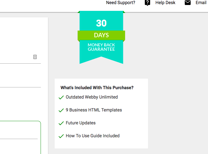
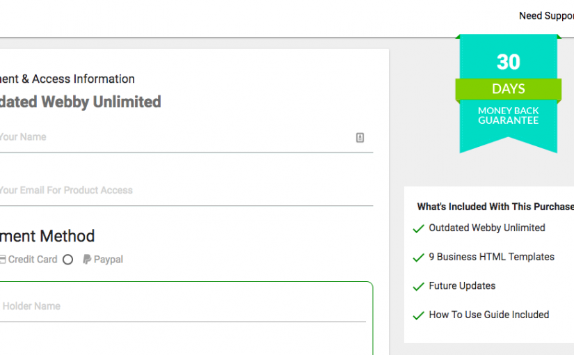
Checkout page is where Customers go to Enter their personal Information
& Enter their Credit Card Information & It’s CRUCIAL that you don’t make any mistakes at this point.
#1. Have a REFUND period. Customers know that they can ANYTIME call their
credit card company for chargeback or Open a dispute if they do not receive what they paid for. Having a Refund offer makes your LIFE easier.
(a) Less Chargebacks, If someone doesn’t like something, they will contact you
to get a refund & We all know how expensive chargebacks can get.
(b) You take the RISK. You are telling your customer that, if something doesn’t go right, you are the one who is taking the RISK, not them.
(c) Makes you more reputable & Shows that you BELIEVE in your product.
DirectPay, Makes it VERY easy to create a Refund period, All you have to do is ENTER the NUMBER of days they have to try out the product on CHECKOUT page.

2. Benefit & What You will get Snapshot. Give customers a list of things that they will get, so they don’t have to go back to sales page.
DirectPay , Makes it VERY easy for you add it with few clicks.

3. HelpDesk & Contact Information – Many vendors do not put their contact information on their checkout page, which is pretty much losing them sales.
With DirectPay, It will AUTOMATICALLY grab your Support URL from your Profit Settings OR if you have a specific one, it will grab it from your product settings.
It also has a way for customers to INSTANTLY email you as well.

